01 / Web Design

Web projects with product thinking.

A curated selection of responsive web products, platforms, and marketing experiences. Instead of showing only final screens, this page highlights the problems I tackled, the decisions I made, and the user experience improvements behind each solution.

30+
Web projects
100K+
Users impacted
B2B + B2C
Across industries
Selected case studies

Each project includes context, role, key design decisions, and mini before/after case blocks to make the outcomes easier to understand for hiring managers and clients.

KnowledgeCity Learning Portal

I joined KnowledgeCity to improve the student experience across the learning portal. My work focused on fixing inconsistencies, redesigning legacy pages that still used the old interface, and creating a clearer learning flow across the platform. I introduced gamification elements to make learning more engaging, improved navigation between lessons inside learning paths, and streamlined key interactions so students can better understand their progress and what to do next.

EdTech Enterprise Platform Design System Responsive Web

The challenge

Learners needed to understand what to do next without getting lost across courses, assignments, deadlines, and duplicated items. The experience had to stay flexible for a growing feature set and multiple breakpoints.

What I did

  • Redesigned inconsistent legacy pages and unified interface patterns
  • Introduced gamification mechanics to make learning more engaging
  • Improved navigation between lessons inside learning paths
  • Streamlined the student learning flow and platform clarity
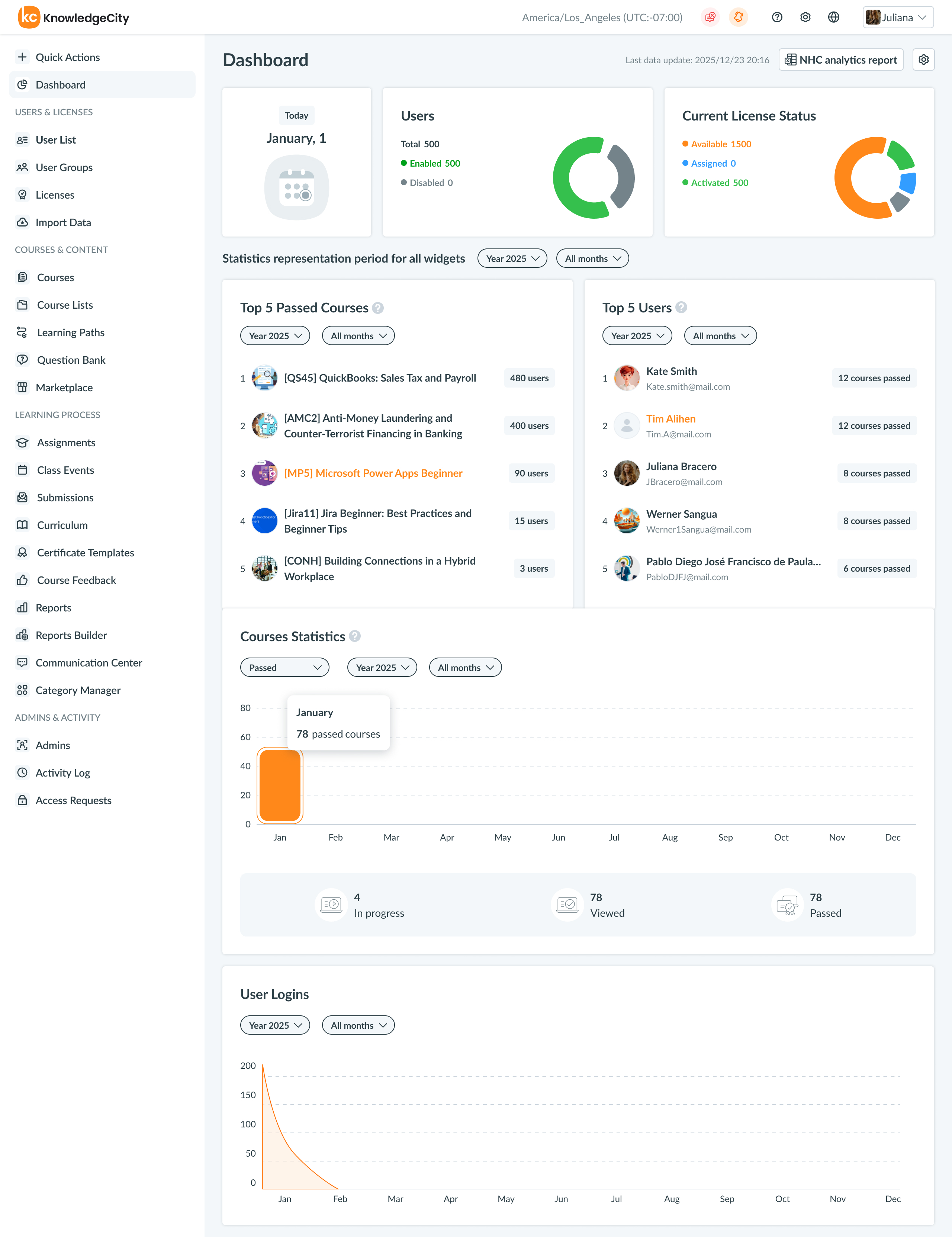
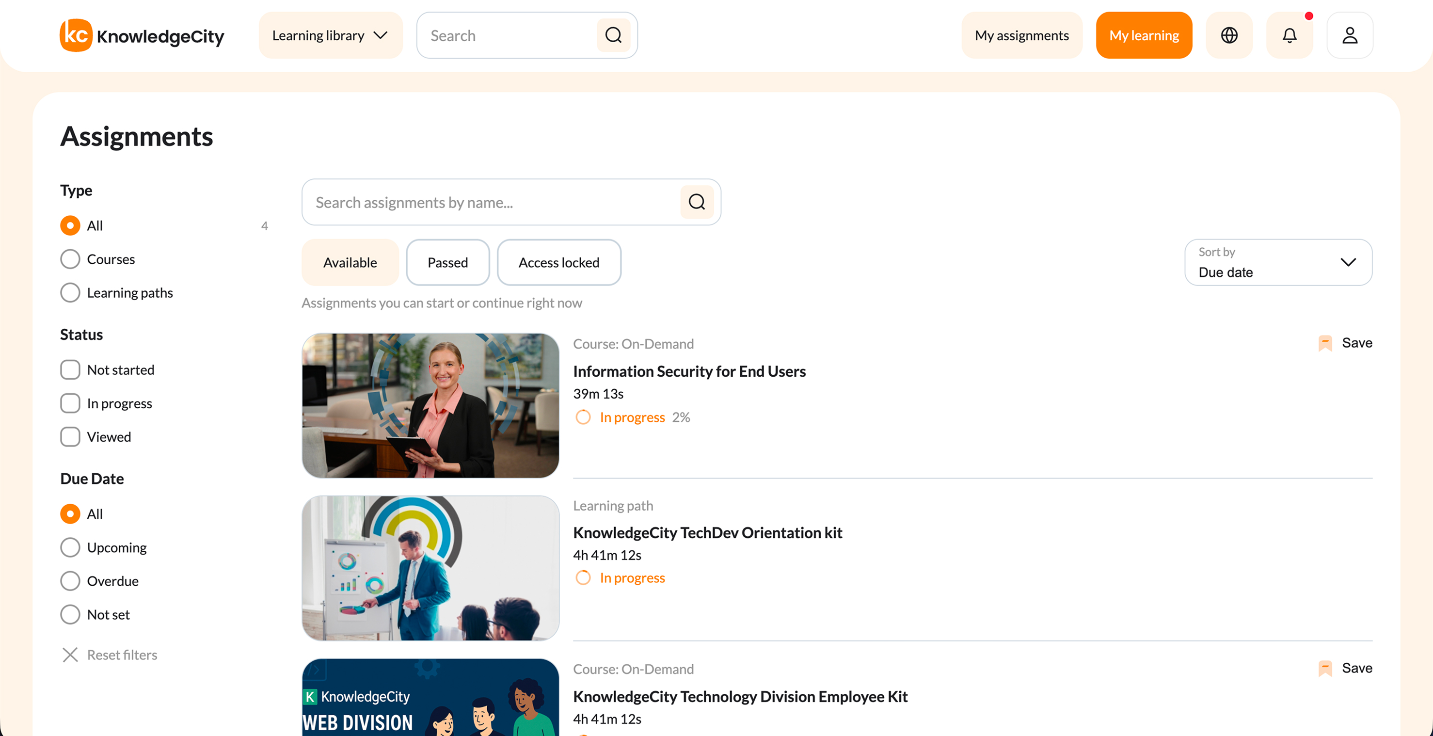
Assignment clarity

Before → After
Before

Assignments appeared fragmented and sometimes duplicated, making deadlines and completion state harder to scan quickly.

  • Weak hierarchy between primary and repeated items
  • High cognitive load when checking due dates
  • Users had to interpret too much structure on their own
After

I reorganized the experience to make status, deadlines, and relationships between items more legible at a glance.

  • Clearer grouping and visual distinction
  • Better deadline visibility and faster scanning
  • Lower cognitive effort for recurring learning tasks
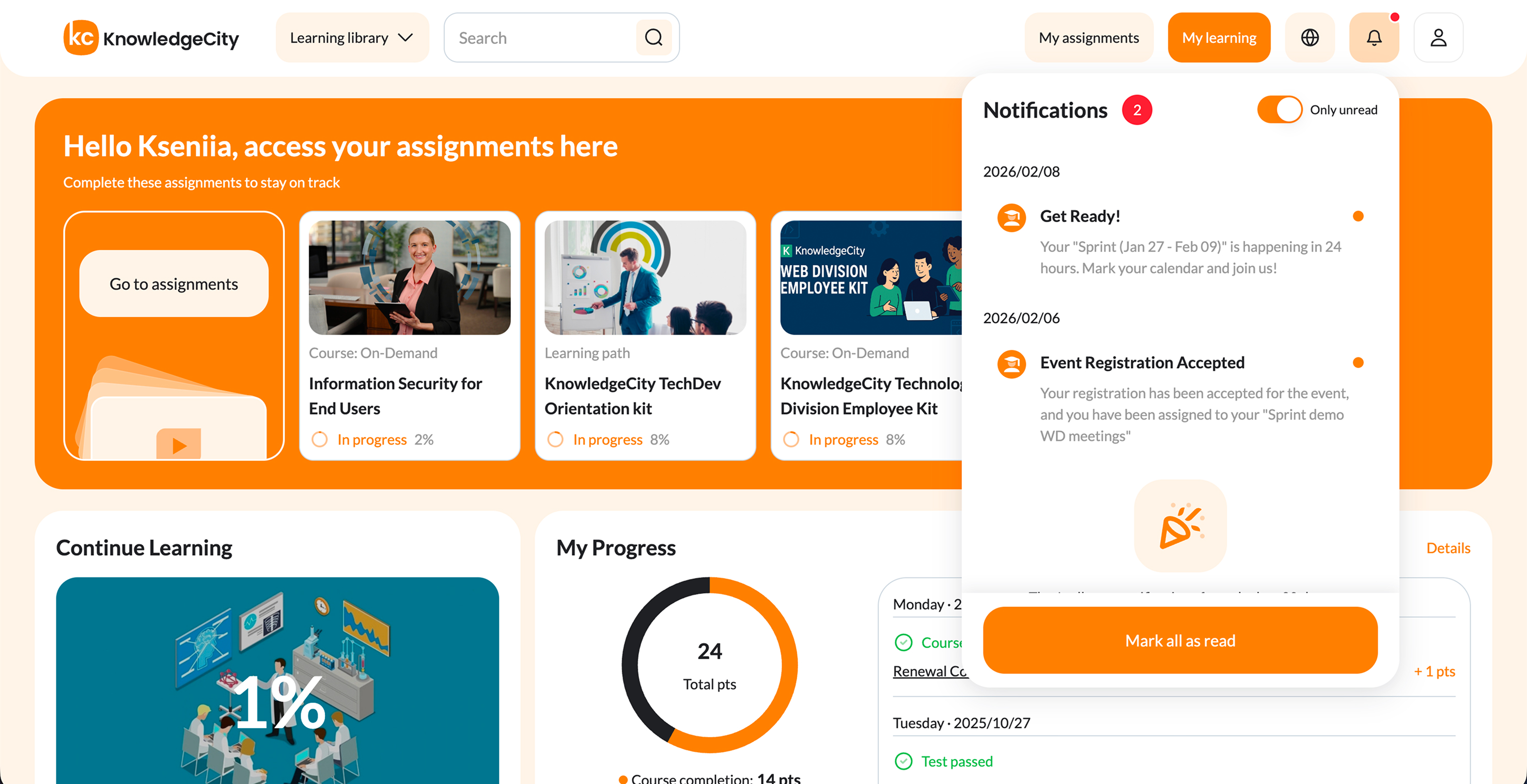
Progress visibility

UX improvement
Before

Course progress was present, but not always easy to interpret as part of the learner's bigger journey.

  • Important information competed for attention
  • Completion state lacked strong emphasis
After

I strengthened visual hierarchy and introduced more intuitive progress cues to help users understand what is done and what remains.

  • Faster recognition of completion status
  • Better orientation inside larger learning flows

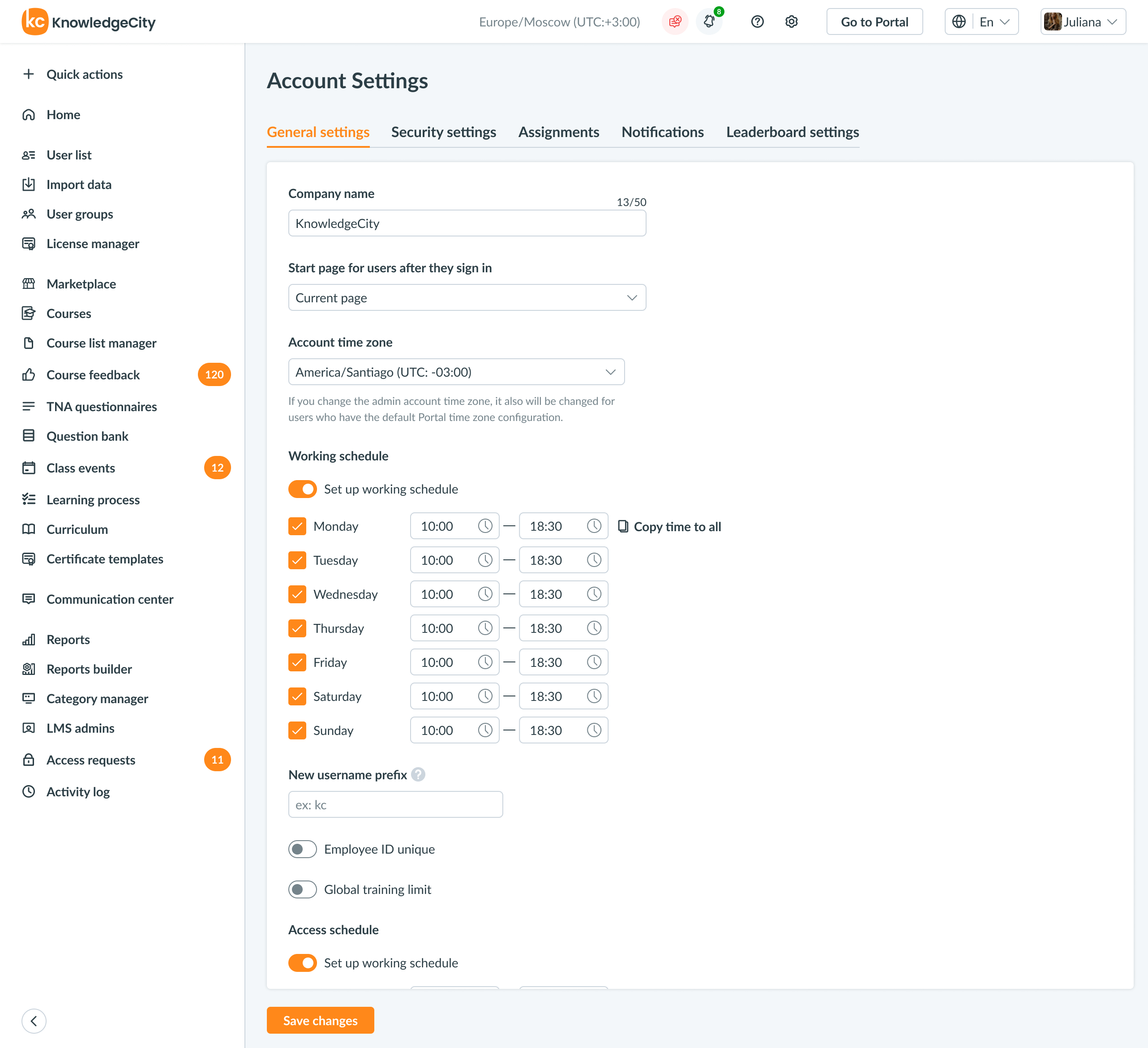
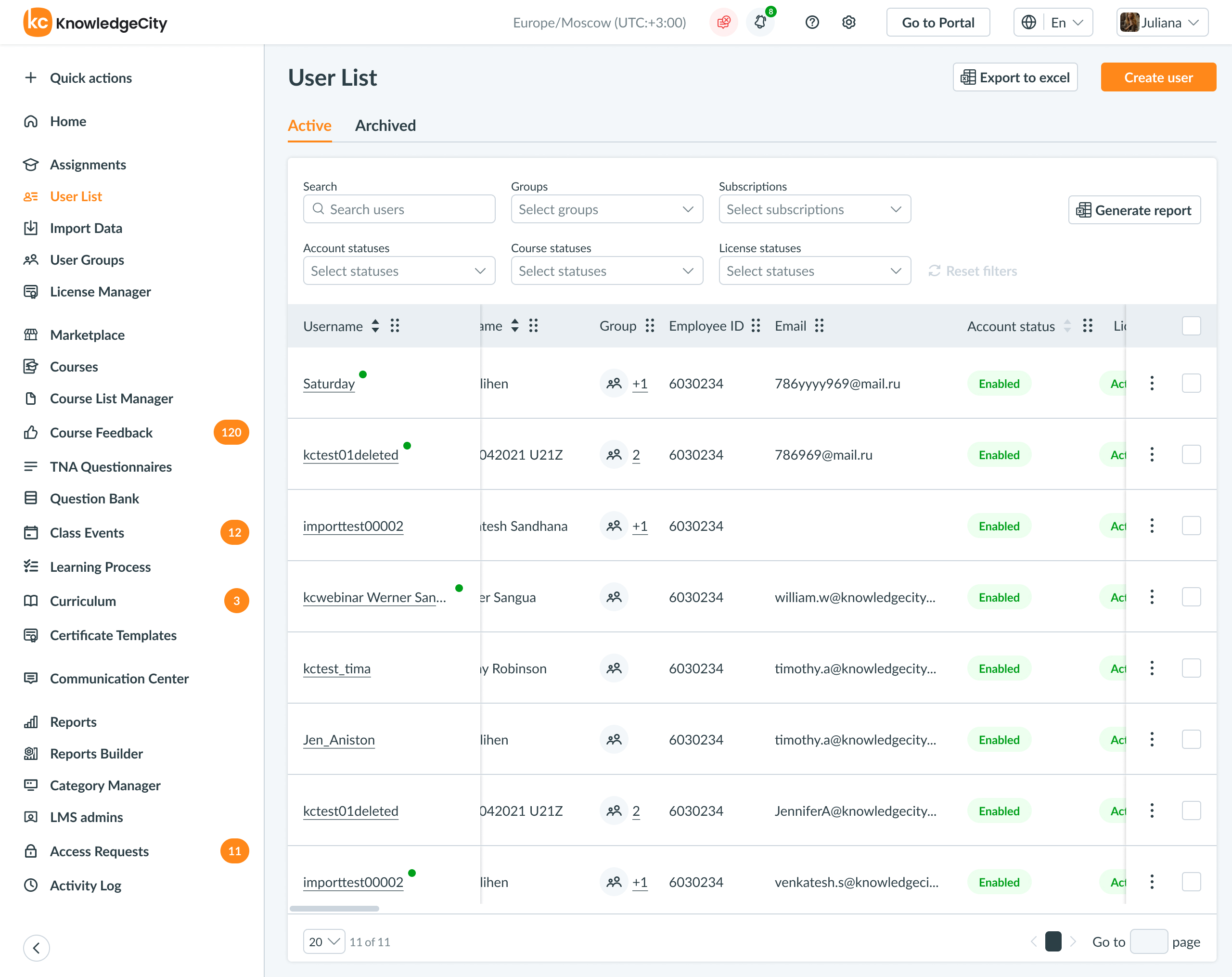
Design system foundation

Scalability
Before

The product needed stronger consistency as more screens, features, and breakpoints were added over time.

  • Repeated design decisions slowed future work
  • Cross-platform cohesion required more manual effort
After

I built an atomic design system to turn repeated interface patterns into reusable foundations for product growth.

  • More consistent UI across the ecosystem
  • Faster feature design and easier handoff
  • Better long-term scalability
Outcome

Improved clarity in day-to-day learning flows and reduced the effort required to understand what to do next.

Product value

Created a stronger foundation for shipping new features without compromising consistency.

Why it matters

Shows product thinking beyond visuals: hierarchy, systems, and real user task support.

KnowledgeCity LMS Admin System

Designed and expanded the administrative system used to manage the platform. I introduced new sections for gamification configuration, created many additional settings pages, and reorganized existing admin flows to make complex configuration tasks easier to understand. A large part of the work involved rethinking and redesigning legacy interfaces while ensuring new features fit coherently into the admin ecosystem.

Admin Dashboard Analytics Enterprise Data Visualization

The challenge

Admin tools often become dense very quickly. The goal was to help users manage learners, content, and settings efficiently without overwhelming them with fragmented controls or unclear data presentation.

My approach

  • Added gamification configuration controls for administrators
  • Created new admin sections and settings pages
  • Reorganized legacy admin interfaces and improved operational flows

Analytics comprehension

Before → After
Before

Metrics existed, but the relationship between them was not always immediately readable in context.

  • Heavy information load
  • Slower interpretation for non-analyst users
After

I introduced cleaner hierarchy, modular dashboard blocks, and more actionable visualization structure.

  • Faster scanning of key signals
  • Better support for admin decision making

Operational workflows

Process design
Before

Bulk actions and admin tasks risked becoming cumbersome when scattered across too many disconnected screens.

After

I designed more coherent workflow patterns so admins could complete frequent tasks with less switching and more confidence.

Outcome

More usable enterprise admin experience with stronger information hierarchy and clearer operational flows.

Design contribution

Turned complex back-office functionality into interfaces that feel more intentional and actionable.

Portfolio angle

Demonstrates dashboard thinking, enterprise UX, and ability to simplify complexity.

Move to Bulgaria

A personal consulting brand and one-page website for a Digital Nomad visa advisory service. I designed the entire experience and implemented the website myself in code. The project includes UX structure, visual design, UX writing, and front‑end development. The goal was to clearly explain a complex relocation process, build trust with visitors, and guide users toward contacting the service.

Landing Page Personal Brand Consulting HTML / CSS / JS

The challenge

The audience needed reassurance and clarity around a stressful relocation process. The page had to explain a nuanced service, build trust quickly, and move users toward contact without feeling pushy.

What I improved

  • Clarified the value proposition above the fold
  • Structured the page into a clearer decision-making journey
  • Added legal and trust signals through policies and disclaimers
  • Built a fully responsive implementation end-to-end

Conversion structure

Before → After
Before

A typical one-page site for consulting can easily become a long information dump with weak prioritization.

After

I structured content as a guided path: value proposition, personal context, service tiers, process, FAQ, and clear contact points.

Trust building

UX writing + credibility
Before

For relocation services, hesitation often comes from uncertainty, risk, and fear of unclear expectations.

After

I introduced clearer explanations, legal context, disclaimers, and a more transparent service narrative to reduce anxiety and build confidence.

IT & Telecom Corporate Website

A full redesign of an existing corporate website for an IT and telecom company already operating on the market. The goal was to modernize the visual identity, rebuild the information architecture, and design a completely new interface from scratch while preserving the company's credibility and technical positioning.

Corporate Site IT & Telecom B2B Trust-focused UX

Problem

Technical products often sound credible to insiders but unclear to decision makers. The website needed to communicate expertise without overwhelming non-technical stakeholders.

Solution

I translated technical complexity into a cleaner B2B narrative through stronger information architecture, confidence-building content hierarchy, and a more direct contact path.

eSIM Service Platform

A product designed from scratch including both the website and a mobile application ecosystem. The web part focuses on the marketing site and onboarding experience, while the overall product also includes a companion mobile app used for managing eSIM services. The goal was to design a cohesive product experience from first visit to active usage.

Marketing Site Telecommunications Conversion Design Dashboard UX

Key idea

Instead of treating the landing page and product account as separate experiences, I designed them as one continuous journey from plan selection to ongoing usage management.

What I designed

  • Built the brand identity and design system from zero
  • Designed the full marketing site focused on conversion
  • Created onboarding, plan selection, and checkout flows
  • Developed a personal dashboard for subscription and usage management

Secure SIM Service Website

A redesign of an existing telecom service website that had been on the market for several years. The company wanted to modernize its online presence and improve clarity of its privacy‑focused product offering. I redesigned the structure, visual hierarchy, and messaging to make the service easier to understand and more credible.

Security Privacy-First Marketing Site Design System

Problem

Security products are often difficult to understand and easy to distrust if messaging feels vague or overly technical.

Design response

I used calmer visual language, stronger hierarchy, and clearer onboarding explanation to make the product feel both more credible and more approachable.

Global Mobile Solutions Website

A corporate website created entirely from scratch for a telecom business that previously did not have a dedicated web presence. The project included defining the structure of the product presentation, building the visual identity for the site, and designing responsive layouts for different devices.

Corporate Site Telecommunications B2B Design Global UX

Flower Shop E-commerce

A custom e-commerce experience designed around visual storytelling, product discovery, and a smoother mobile-first buying journey. The project focused on helping users browse, choose, and checkout with less friction.

E-commerce Responsive Design UX Optimization Conversion

Earlier works

My earlier experience includes secure services, enterprise dashboards, HR systems, financial products, and marketplace experiences. Across these projects, the common thread was simplifying complexity, improving usability, and designing interfaces for very different business contexts.

VPN B2B SaaS HR Tech FinTech Marketplace
Let's work together

Product design & systems
Conversion‑focused UX

I'm available for product design roles and product collaborations. If you need a thoughtfully designed website as part of a larger product or brand project, I'm also open to project-based work.

resong.design@gmail.com