Spaceflight Simulator 2 — Landing Page Redesign
Spaceflight Simulator 2 — Landing Page Redesign
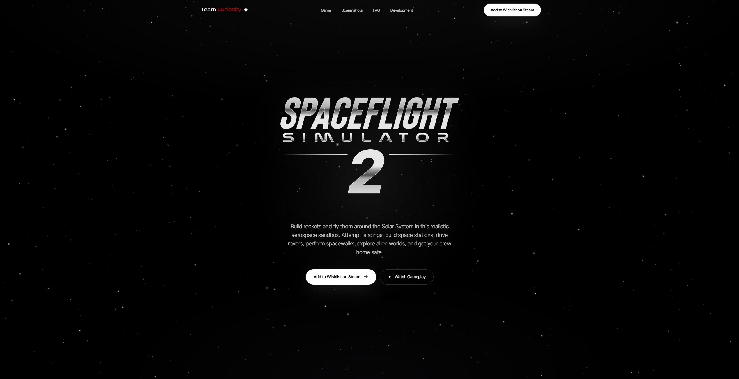
The job of this page is one thing: convince a visitor in 10 seconds to click Wishlist on Steam or Pre-order. Wishlist count is the single most important currency for an indie launch on Steam — Valve's algorithm rewards titles that accumulate them. Everything on the page has to serve that funnel, so I redesigned and built one that does the persuasion work the old version offloaded onto the visitor's imagination.
The brief
Convert a visitor in 10 seconds — Wishlist on Steam or Pre-order. Wishlist count is the most important currency for an indie launch: Valve's algorithm rewards titles that accumulate them. Every block on the page has to serve that funnel.
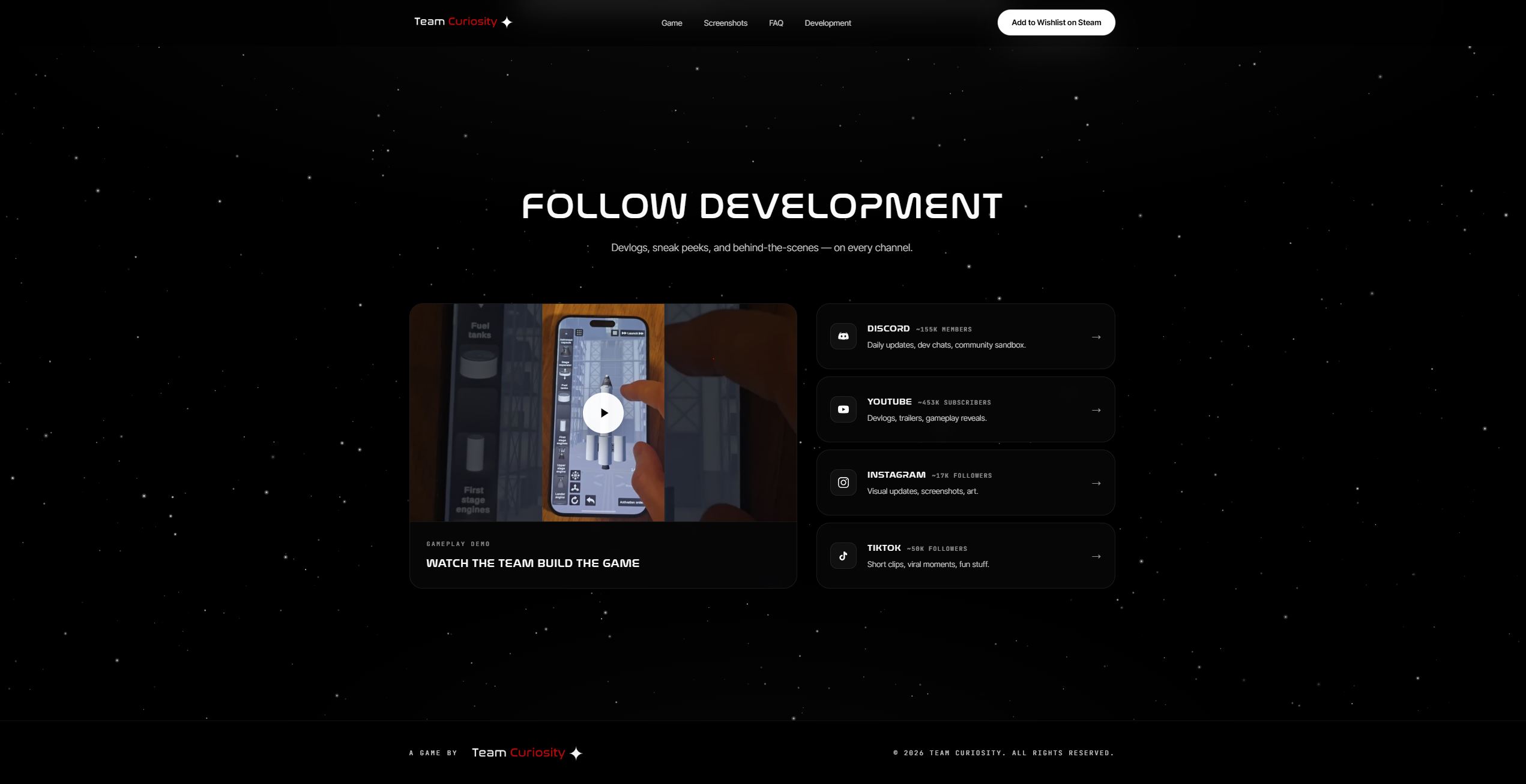
What I built
- Atmosphere hero — animated star field with parallax depth and drifting shooting stars
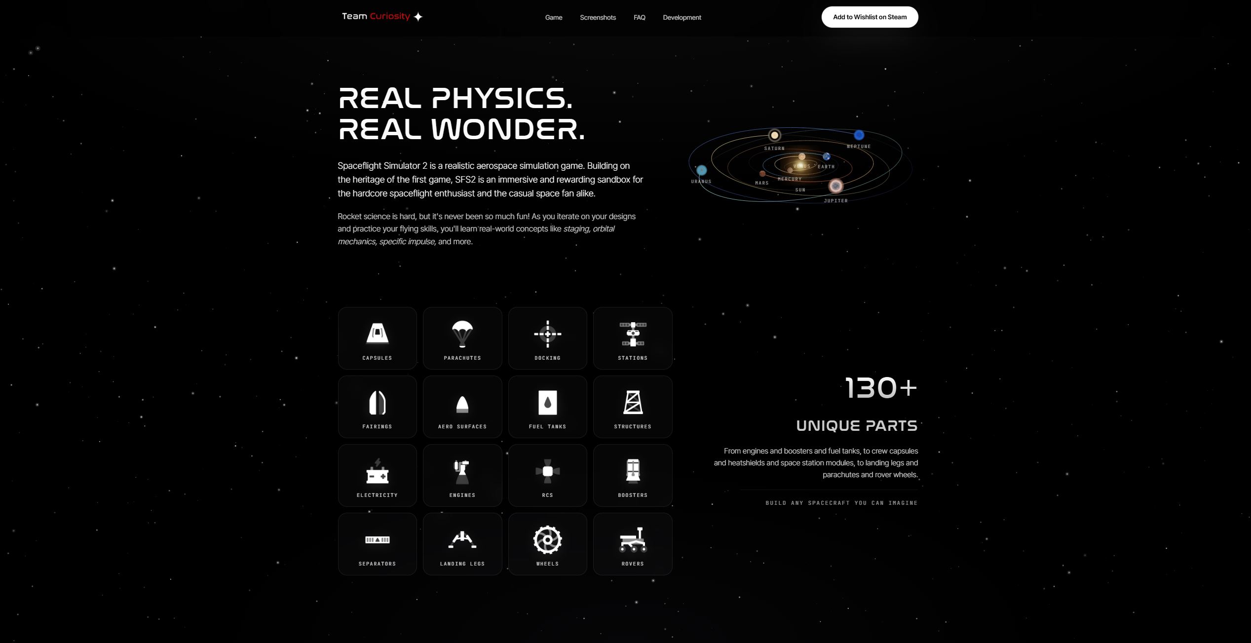
- Interactive solar system — eight orbiting planets with real textures and coloured trails
- Real parts catalogue — 16 in-game icons proving the "130+ Unique Parts" claim
- Coverflow screenshots — drag, swipe, click-to-lightbox carousel
- Cohesive system — aerospace display typography, monospaced labels, glass surfaces
From product page to launch page
Before → AfterA functional but flat product page: header banner, paragraphs of copy, screenshots strip, store buttons. It worked, but it didn't feel like the game.
- Nothing demonstrated what makes SFS2 special — no atmosphere, no sense of scale
- No proof that the simulation behind it is serious
- The visitor had to take the value proposition on faith
A purpose-built landing page that shows the game instead of describing it.
- Full-screen space scene at the top — animated star field, parallax depth, drifting shooting stars. The brand tone lands before the user reads a single word.
- Interactive solar system in the About section — eight planets with real textures orbit the Sun on tilted elliptical paths, each leaving a coloured trail. The demo of the game, embedded in the page.
- Real parts catalogue — 16 in-game part icons behind the "130+ Unique Parts" headline. Replaces a marketing claim with proof.
- Coverflow screenshots carousel — centre frame is large, sides recede and dim, drag and swipe work, click opens a lightbox.
- One consistent system across everything — dark space palette, aerospace display typography, monospaced technical labels, soft glass surfaces. The site feels like the cockpit, not a marketing brochure.
The page now does the persuasion work that the old version offloaded onto the visitor's imagination.
Site, Steam page, and in-game UI now feel like one product. Trust translates directly into store conversion.
The animated solar system and the coverflow are the kind of details that get screenshotted and posted — a free marketing layer the old page didn't have.
60%+ of game-discovery traffic is on phones. Every interaction is built for touch first, not bolted on.
Nothing here is decoration for decoration's sake. The atmosphere block exists because games sell on emotion. The orbital map exists because "realistic physics" is a better claim when you can see it. The parts grid exists because "130+" is louder when you can count the icons. Each block earns its place in the funnel — and each one was iterated on against the actual product behaviour, not picked out of a moodboard.